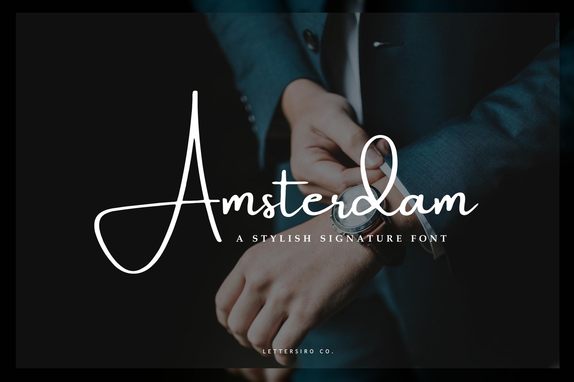
Amsterdam Typeface Review: A Signature Font for Digital Branding
I was staring at a blank Figma canvas, trying to nail the hero section for a new coaching client’s landing page. The brief was simple but tricky: modern, approachable, yet authoritative. We had tried bold sans serifs, which felt too corporate, and delicate scripts that lacked weight. Then I pulled up Amsterdam, a stylish signature font from Script Amp. After dropping it into the layout, testing it against various background images, and checking its performance on mobile viewports, I realized this typeface might be the missing piece in our digital brand kit.
Amsterdam is not just another decorative script; it is a premium font designed with modern photography and editorial aesthetics in mind. It carries a "signature" vibe—handcrafted but polished—which makes it incredibly versatile for web design, social media graphics, and high-end digital products. Below is my honest review of how Amsterdam performs in real-world web layouts, focusing on usability, visual hierarchy, and brand identity.
Visual Personality and Creative Appeal
When you first load Amsterdam into your design software, the immediate impression is one of effortless elegance. As a script font that bridges the gap between handwritten charm and structured typography, it avoids the overly messy look of casual handwriting while retaining a personal touch. This is crucial for web design, where trust and professionalism are paramount.
The letterforms have a fluid rhythm, with natural variations in stroke width that mimic the pressure of a calligraphy pen. However, unlike many decorative fonts that struggle with legibility, Amsterdam maintains a clean structure. It feels like a creative font that has been refined for commercial use. Whether you are designing a boutique online store or a portfolio homepage, Amsterdam adds a layer of sophistication without shouting for attention. It works beautifully as a display font for headlines, allowing the text to act as both content and decoration.
Performance in Hero Sections and Landing Pages
In my test project, I placed Amsterdam in the main hero banner, overlaid on a soft-focus lifestyle image. The font’s contrast allowed it to pop against the lighter areas of the photo while remaining readable against darker tones. Because it is inspired by modern photography, it pairs naturally with imagery that features clean lines, natural light, and minimalist compositions.
One of the biggest challenges in web design is balancing aesthetic appeal with user experience (UX). Amsterdam excels here because its typeface characteristics guide the eye effectively. When used for a headline like "Elevate Your Business" or "Creative Strategy", the signature style draws immediate attention. However, I found that keeping the text short—two to four words max—was key. Long phrases can become visually cluttered, disrupting the scanning behavior of visitors.
I also tested Amsterdam on a dark background using white text. The negative space within the letters held up well, preventing the text from feeling heavy or muddy. For landing pages aiming for a high-conversion, premium feel, this level of clarity is essential. It signals quality before the user even reads the subheading.
Font Pairing and Hierarchy
No premium font exists in isolation, and Amsterdam is no exception. To let the signature style shine, it needs a strong support system. In my layout, I paired Amsterdam with a clean sans serif font for body copy and navigation menus. The contrast between the organic curves of Amsterdam and the geometric precision of the sans serif created a balanced visual hierarchy.
Here is how I recommend pairing them:
- Headlines & Titles: Use Amsterdam to establish brand personality and emotional connection.
- Body Copy: Stick to a highly legible sans serif font (like Inter, Lato, or Helvetica) to ensure readability on small screens.
- Accents & Quotes: Use Amsterdam sparingly for pull quotes or testimonial headers to add a touch of editorial flair.
Attempting to pair Amsterdam with another script font or a heavily decorated serif font often results in visual competition. The goal is to let Amsterdam be the star while the supporting typography handles the information delivery. This approach aligns with modern editorial design principles, where typography serves the content rather than overpowering it.
Readability and Responsive Design Considerations
Testing on mobile devices revealed some important constraints. While Amsterdam looks stunning at large sizes, scaling it down for small buttons or dense dashboard interfaces can compromise its character. The intricate details of the signature strokes may blur or become indistinct on lower-resolution screens.
For responsive layouts, I suggest the following best practices:
- Limit Usage: Reserve Amsterdam for primary headings, logos, and short decorative elements. Avoid using it for long paragraphs or navigation text.
- Check Contrast: Ensure sufficient contrast between the font color and the background. On image overlays, use semi-transparent shapes behind the text if needed to maintain legibility.
- Webfont Optimization: If using Amsterdam as a webfont, check the file formats provided. Modern web design requires WOFF2 files for fast loading. Ensure you have the necessary weights (Regular, Bold, etc.) to maintain hierarchy without overloading the page with multiple font files.
Additionally, accessibility should always be a priority. While Amsterdam is beautiful, it may not meet strict accessibility-heavy interface standards for users with visual impairments due to its decorative nature. Always provide clear, standard text alternatives for critical information.
Commercial Licensing and File Formats
Before deploying Amsterdam in any client project or online store, verifying the commercial font licensing is non-negotiable. Script Amp typically offers robust licensing options that cover web usage, but it is vital to confirm whether your specific use case (e.g., SaaS product, e-commerce theme, or marketing campaign) is covered under the standard license.
The package usually includes multiple file formats (OTF, TTF, WOFF), which ensures compatibility across different browsers and design tools. Checking for included alternates, ligatures, and swashes can also enhance your designs. These special characters allow you to customize the look of the text slightly, adding unique touches to logo design or brand identity assets without needing to modify the base glyphs manually.
Final Verdict for Digital Creators
Amsterdam is a standout addition to any designer’s toolkit. It successfully captures the essence of modern, photography-inspired aesthetics while remaining functional for web environments. It is ideal for online shop banners, course sales pages, and portfolio sites where establishing a distinct, high-end brand voice is critical.
If you are looking for a creative font that elevates your digital brand kit without sacrificing readability, Amsterdam delivers. Just remember to use it strategically—let it lead the conversation in your headlines, and let cleaner typefaces handle the details. With proper pairing and mindful implementation, this typeface can transform a standard website into a memorable digital experience.